18 May 2017

Speed & prestige: the example of papyrology

I wanted to quickly throw in a quick thought on a recent series of blog posts, starting with one by Andre Costopoulos entitled “The traditional prestige economy of archaeology is preventing its emergence as an open science.” In it he points to the power of the fuzzy concept of "knowing the material" and the way this hinders the transformation of archaeology into an open science.

Bill Caragher reads the piece as "[a] critique of slow archaeology" in his response, returning to a theme Bill has thought and written and talked a fair amount about.

Finally Dimitri Nakassis directly addresses one of Costopoulos' points in "Slow archaeology & the prestige economy" as less of a critique of the main idea (as I read it anyway) than as an observation that the solution might not be the one he proposes:
But what’s really at stake in specialists defending their turf isn’t data or knowledge (exactly), but rather skill. My friend Kim Shelton could make all of her pottery databases available to me but that wouldn’t make me a specialist in Mycenaean pottery. I wouldn’t know what she knows, I won’t have seen what she’s seen. If I used her databases to write an analytical article about Mycenaean pottery, I wouldn’t be welcomed into the warm embrace of Mycenaean ceramicists. I wouldn’t be one of them. I wouldn’t have their skill or their knowledge, just their data.
I don’t think that open data will really democratize the archaeological academy. To answer Costopoulos’ question, “If the information that formed the impressions is suddenly democratized, what power will the clergy hold?” The answer is: plenty.
I'd suggest we actually have an existing example of open data and its effects on an archaeology-related field: papyrology. Papyrology was a fairly closed field as recently as the 1990s. As with archaeology, this was partly due to the difficulty in obtaining and then maintaining the materials for study. With the advent of cheap(-ish) digitization and the internet itself, papyrologists suddenly found that it was possible to share their materials in a way that, if it wasn't quite as good as actual autopsy, was pretty darn close, and would surely be closer and closer as time went by.

Not all papyrologists that I spoke with in those years were super-excited about this, as I remember (and I speak as an outsider, so I'll happily be corrected). In fact they were so slow about taking advantage of the internet that I wrote and maintained a "Papyrology Home Page." I can remember conversations in which the worry was explicitly stated that non-professionals might get a hold of images on-line and write and publish poor-quality articles. (I never quite understood how that was supposed to happen, since the other traditional area of gate-keeping—journals—certainly wasn't going out of the professionals' hands.)

Within a few years, whatever reluctance there had been was overcome and now papyrology stands as a nice example of a field with solid on-line scholarly aids and international collaboration between institutions and scholars. And to a large degree they share their "stuff," too, over at papyri.info.

What's been the impact on the field of papyrology? Again, as an outsider, I'd say that it has done pretty well. Certainly their version of an open-data approach doesn't seem to have doomed their "clergy" to a loss of prestige, nor—as Dimitri suggests—does the field seem to me to have become more democratized.

It might be worth considering in some more detail whether the experience of the papyrologists has something to offer us over here in archaeology. What do they and others think has happened since their embrace of an idea many feared?

(Thanks to Eric Poehler for his persistent tweeting that finally got my attention.)

21 January 2017

A Millennium is 1,000 years long

There's been a lot already written about Trump's inaugural address. (Here's a good piece by James Fallows.) I'm a little surprised not to have found any comments so far on a line that struck me:
We stand at the birth of a new millennium...
"Millennium" isn't one of the "first time in an inaugural" words that Trump used yesterday.

It occurs in two earlier addresses, Nixon's first, where he refers to the upcoming bicentennial and observes that some alive at that time would live to see "the beginning of the third millennium"; and Clinton's second, where he notes that they were "at the edge of a new century, in a new millennium." (Interestingly George W. Bush, sworn in at the start of the new millennium, didn't mention it at all, preferring to refer to the "new century.")

The idea of "ages" of civilization is a pretty old one. The Greek poet Hesiod described the now conventional "metal" ages (γένεα) of gold, silver, bronze, and iron (with some demigods thrown in for good measure) with their continual decline. The Romans too, perhaps taking their lead from the Etruscans, had their ages, saecula, which were more like centuries (the Latin word saeculum means a literal "century" as well as a less precise "age" and gives us the English "secular"). The idea was picked up by some at the beginning of the United States and, in a lightly adapted line from Vergil's fourth Eclogue, appears on the reverse of the Great Seal of the United States, and thence on our money: Novus ordo seclorum ("a new order of the ages").

This phrase also plays a role in some of the "new world order" conspiracies, but we'll leave that alone here and get back to Trump's phrase.

Both earlier inaugural uses of "millennium" make some sense in that they were referring to an actual start of a millennium. But that's a bit of a stretch for us here in 2017. While in relative terms it's now pretty early in the current millennium—and maybe it seems more so to those of us who've spent most of our lives in the 20th century—the millennium has been "born" for a while now (in its "infancy"?). But it strikes me that there is a precedent or declaring the start of a new thousand-year period, and that unfortunately is to be found in Hitler's notion of a "tausendjähriges Reich," referred to, for example, in Riefenstahl's film Triumph of the Will. This is sadly not the only bit of Nazi-related rhetoric in the speech. As has been noted repeatedly (see this March 2016 letter to the NYT), the Trump campaign's "America First" slogan, repeated in the address yesterday, has its origins in the isolationist America First movement associated with anti-Semitism.

In something apparently mostly written by Steve Bannon, former executive chair of Breitbart news, which he called "the platform for the alt-right," this is not surprising and continues the dangerous pattern of Trump's dog whistles—and worse—to the intolerant right.

01 August 2016

Spreadsheet to GeoJSON: Part 2, in which I do not re-invent the wheel

My last post was about doing a simple, but automated conversion of our growing Google sheet of Roman temples into GeoJSON. At the end, I noted that there were some existing methods for doing that, and in the interim I’ve been exploring those a bit.

Most of them involve some kind of javascript and are designed for use on websites (or with node). That’s pretty nice in some circumstances, and in fact I’ve been playing around with them, trying to improve my leaflet.js skills in the process.

However I’m still interested in being able to download our data and convert all of it to GeoJSON which gets posted to GitHub, for which javascript isn’t ideal (and I think I could make it work, if I knew js better), but there is some software out there that means I don’t have to worry about the actual conversion from sheet to json, though I do have to do some clean up. Ideally the script will not require any interaction, and it will convert all the data we have into GeoJSON, not just the bits that I tell it about. This will let us add and delete columns in the sheet without worrying about whether it will screw up the conversion.

The Details

Temples and Mithraea around Rome.
Temples and mithraea mapped in the area of Rome.
I settled on the nifty ogr2ogr utility from GDAL, the Geospatial Data Abstraction Library, to do the conversion (or conversions, as it turned out), and still did some cleanup with jq and the usual text-manipulation tools. The script was written in bash, so it can be run from the command line (or automatically via cron, or LaunchDaemon these days, I guess). Here’s how the script goes:
  1. Download the sheet from Google as xml: https://spreadsheets.google.com/feeds/list/key/1/public/values, where key is the key for the sheet. Pretty sure that I can get csv if I authenticate to Google, but I couldn’t figure out how to do that in a timely way, so I stuck with the public feed. When I tried to download those versions via the browser, it did work, likely because I’m logged into Google services all the time, but possibly because Google doesn’t like people using curl to get data, but will allow a real browser to. In either case, I didn’t want to have to rely on the browser for this, so I stuck with what I could get via the command line.
  2. Reformat and clean up the xml with tidy -xml -iq and then sed 's/gsx://g'. (Google really likes those gsx prefixes on the field names.)
  3. Use ogr2ogr to convert the xml to csv. ogr2ogr seems to need files to work on, so at this point I also stored the data in temporary files. (Happy to be wrong about the necessity for files, so let me know!)
  4. Now use ogr2ogr again, the time to convert the csv to GeoJSON. You’d think I could convert the xml directly to GeoJSON, but, again, I couldn’t figure that out (.vrt files) and so resorted to the double conversion. Help welcome!
  5. At this point, I do a little more clean up, getting rid of some fields from the xml that I don’t want (via grep, jq, and perl) and removing the false 0,0 coordinates that get generated instead of null when the sheet cells for longitude and latitude are empty.
  6. Finally I save the resultant file to my GitHub sync folder. I also generate a version that has only entries with coordinates, which can be mapped without complaints. That last is handled with jq and tr.
In the end then I’ve got a nice little script that does the job. Some improvements include getting ogr2ogr to do the xml-to-GeoJSON directly and using Google auth codes to avoid having to have a public sheet. One thing perhaps best left for another script is the creation of leaflet-related properties connected to how the icon gets displayed (icon color, image, etc.).

As usual the script is up on GitHub, where it’s annotated with more detail, and you can see the resultant map up there too (the area around Rome is shown in the image up above).

08 July 2016

Google Sheets to GeoJSON

Part of my summer is being spent working with a Drew University College of Liberal Arts student, Alexis Ruark, on growing a database of Roman temples. This is part of Drew's new Digital Humanities Institute, partly funded by the fine people at the Mellon Foundation (on which more soon, I hope).

There are of course plenty of data out there on ancient places, including Pleiades, the Digital Atlas of the Roman Empire, and Vici.org, but what we're trying to do is create a database with more detail than those more generic projects (and I don't mean "generic" in a bad way here). In turn we hope to be able to contribute back to them (especially as we've relied on some of their data to kickstart our own work).

Alexis is working in a Google spreadsheet for a number of reasons, including easy sharing between us and the advantages that spreadsheets offer in general (e.g., sorting rows and moving columns around). But it isn't so easy to share data in that format, and there is already an existing format for sharing geographical data, namely, GeoJSON, so I'd like to be able to convert from the sheet to that format. (I'm also thinking ahead a little bit to when the projects grows up a little, and having the data in a different format will be more useful, if not necessary.)

First step, of course, was to do an internet search for converting Google sheets to JSON. Turns out the Google APIs themselves support conversion to one kind of JSON, so I figured this might be a nice little project for me to work on my coding skills while I learned more about JSON and the software that's out there already.

What I found

One page with some hints on converting Google sheets to JSON can be found here. In brief Google provides a feed of your spreadsheet in JSON format as long as you publish the spreadsheet to the web. Here's what that URI looks like:

https://spreadsheets.google.com/feeds/list/<sheet_ID>/1/public/values?alt=json

where the "<sheet_ID>" is that long code that shows up in the URI to your spreadsheet. One change that I had to make to the instructions on the site was to the part of the path that shows up right after that ID (a "1" here). It seems from the Google documentation to indicate the key of the sheet in your file that should be exported. (Happy to be corrected on that. See my comment on that article for some more links.)

The Process

Here's what I came up with:
  1. Get the JSON via the Google API and curl.
  2. That JSON isn't GeoJSON, so it needs to be processed. This was a chance for me to do some more work with the very powerful command-line app, jq, which I learned about from a great post by Matthew Lincoln on the Programming Historian. That took a few step:
    1. Remove the odd prefixes Google sticks on the column headers: "gsx$". It's not strictly necessary, but it does make the JSON—and the rest of this script—a bit more readable. For this I just used sed 's/gsx\$//g'.
    2. Pull out just the JSON for the rows, leaving out the info about the spreadsheet that is prepended to it. Here's the first use of jq: jq -c '.feed.entry[]'.
    3. Create a proper GeoJSON file with those rows, using only the necessary data (just longitude, latitude, and name for now): jq -c '{type: "Feature", geometry: {type: "Point", coordinates: [(.longitude."$t"|tonumber), (.latitude."$t"|tonumber)]}, "properties": {name: .temple."$t"}}' | tr '\n' ',' | sed 's/,$//g'. There are a couple of things going on there:
      • First, the coordinates had to be interpreted as numbers, but the API quotes them as if they were text. jq's tonumber function takes care of that, used inside parentheses with | (a new one for me).
      • jq also spits out each row as a separate JSON object, but they need to form part of a bigger object. This requires commas between them in place of the new lines that jq leaves when it's doing compact output, indicated by the -c option. tr took care of that, and sed removed the comma that got inserted at the end of the file.
      • The rest just uses jq to take the appropriate fields from Google's JSON and puts them where GeoJSON requires.
  3. Finally, I fill a file with this data, flanked by some needed opening and closing code:
    • Prefix for the GeoJSON file: {\"type\": \"FeatureCollection\",\"features\": [
    • All that nice JSON from the previous step.
    • Closing brackets: ]}
    • Then, for esthetics and readability, I use jq to reformat the JSON: jq '.'
    That file gets saved to my local copy of the GitHub repository for this project, so that when it gets synced, the work is backed up with a version history, and we get the added bonus that GitHub shows GeoJSON files as maps by default.
I saved the whole thing as a bash script with a little more error checking than I discussed here. You can check it out on GitHub.

Other methods

Turns out I should have searched for "google sheet to GeoJSON" instead of just "JSON" when I started this, as there are several existing ways to do this. My own offers some advantages for me (like saving to my GitHub repository), and I'm glad I took the time to work through the coding myself, but I'm looking more closely at these others to see if I can't use them or contribute to them to come up with a better solution.

One nice approach, called Geo, uses a script that you add to your spreadsheet. It will then let you export a GeoJSON file. Like my script (so far), it's limited to exporting just the geographical coordinates and an ID for the point. It will also look up addresses for you and fill in coordinates for them, which is not something that our project needs, but is very nice regardless.

A second method, csv2geojson, uses javascript to convert csv files to GeoJSON. In addition to making a collection of individual points, it can convert a list of points into another type of geographical entity, a line string.

A third looks very nice, but isn't working for me, gs2geojson. It adds a color option for the markers, which is appealing and suggests that it might not be too difficult to handle other columns as well. My javascript skills are poor, so I'm hoping it hasn't been abandoned...or maybe it's time to take on another student researcher who knows more than I do!

The last project I'll mention looks the most appealing to me right now: sheetsee.js, maintained by Jessica Lord, a software engineer at GitHub. It can read your sheet and grab all of the columns. The demo shows them being used in a pop-up upon hovering over the point. It also relies on tabletop, which is what actually reads the sheet and returns it as a simple array of JSON objects, so add that to the list.

The Future

Ultimately I may need to do some significant manipulation of some of the data in the sheet, so I think I'm going to talk to a few people who know more than I do about this to find out what they do, and I'll also delve a little more deeply into some of these other methods. At the very least, I'll learn more about what's out there and improve my coding skills.

29 June 2016

Exposure Fusion for better on-site photos

Introduction

1. Awkward group of students casting shade.
(Credit John Muccigrosso)
If you've spent a few seasons on an archaeological site, odds are you've seen something like the scene in the first photo here: a bunch of people standing awkwardly close together, possibly holding some largish item, and bending their limbs at odd angles. They're trying to provide some shade so that the (possibly ad hoc) dig photographer has a subject with roughly consistent lighting. There are more elegant ways of achieving the same thing, of course, as in photos 2 and 3, but the idea is the same.


Large plastic sheet(?) used as shade. Credit Esri.
 2. Large plastic sheet(?) used as shade. (Credit Esri)

3. Reflector used for casting shade. (Credit Kate Devlin)
Sometimes though it's just not possible to completely eliminate the problem. Maybe you're trying to take a photo of a really large area, or maybe you're the only one around. Fortunately with the advent of digital photography, there is another approach: exposure fusion.

The Problem

Let's look at what the actual problem is.

Detection

Any light receptor has a range of brightness that it can detect. Any values beyond a certain brightness register the same maximum value ("white") and any below a certain point register the same minimum ("black"). This is called the dynamic range of the detector, or, more typically in photography, its exposure range. In the photography world, this range is measured in stops, which work in a base-2 log system, so that for every one-stop change, the value either doubles or halves. If you're handy with a camera, you'll be used to this because exposure times, f-stops, and ISO are all traditionally adjusted in increments of one stop...or so: note how shutter speeds are (were?) given as fractions of a second: 1/125, 1/60 (not twice 1/125), 1/30, 1/15, 1/8 (not twice 1/15), 1/4, 1/2, 1, and so on. (Camera buffs should note that 1 EV is equal to one stop.)

What's the range of common detectors? Well, the human eye is pretty good at this. It can detect a total range of something like 46.5 stops, which equates to the brightest thing being one hundred trillion (100,000,000,000,000:1) brighter than the darkest. That range foes the brightest daylight all the way to dimly lit nightscapes, and the eye accomplishes this remarkable feat by constantly adjusting to changing light levels. In daylight the range might be more like ~20 stops (or 1,000,000:1), but some sources say it's more like 10-14 stops (1,000:1 - 16,000:1). In any case, it's pretty big, but remember that this large range can't all be successfully detected at the same time.

Camera print film (remember that?) has an exposure range of approximately 10-14 stops, which is comparable to the human eye. Normal digital DSLRs can do 7-10 stops (128:1 to 1000:1), which is less than the eye. Slide film is lower still at 6-7 stops, and digital video is even lower at ~5.5 stops (45:1).

Recreating

How about output devices? If your camera can record 10 stops, how many stops can whatever is displaying the photo show? Remarkably (to me, anyway), paper can only do about 6-7 stops, which is about 100:1. The computer screen you're likely reading this on does a lot better at something up to 10 stops (1000:1). High dynamic range (HDR) monitors do a lot better at ~14 stops (30,000:1).

The situation gets a little more complicated with digital files, because of computational techniques that are applied to the data. The detector in the camera is like a grid (I'm oversimplifying here), and each cell in the grid is a pixel. so the camera hardware has to measure the light hitting the pixel and write that number to a file. For simplicity, think about a gray-scale image: the camera writes the light intensity as a number from 0 to whatever it goes up to. One wrinkle is that some image-file formats can't handle the same dynamic range as the camera's detector. If you're old enough to remember working on monitors with limited output (like the original Macs that had a dynamic range of 2, so pixels were either black or white), you'll know what this does to images. Since image files are binary formats, they tend to work in powers of 2, like the stops, so it's easy to go from the number of bits used to record light intensity to the number of stops. An 8-bit image has 256 levels of brightness, like 8 stops. The common format of JPEG is an 8-bit format (and "lossy" due to compression of the image), but it can achieve dynamic ranges up to about 11 stops due to non-linear transformation of the data coming off the camera detector (another wrinkle). If your camera can save raw files, those will typically have the maximum dynamic range that your camera can measure.

(I'm ignoring a lot of nuance to everything I just wrote about, but it's easy to immerse yourself in the details of this stuff, if you like.)

What's the problem again?

Back to the problem...
Like your eye, almost all cameras will make adjustments to maximize picture quality. Cheap ones do it automatically and don't let you make any changes, and more expensive ones will let you control just about everything. Insofar as they adjust then, cameras are like your eye. The problem is, they lack your brain which does a lot of heavy lifting in the background as your eye moves around the scene and adjusts, and an image taken by a camera has to be taken at only one setting. If the dynamic range of the image exceeds that of the camera, then part of the image will either be too dark or too light, and thus all the various shades of "too dark" will be black and the "too light" all white, even though the scene might have looked fine to your eye.

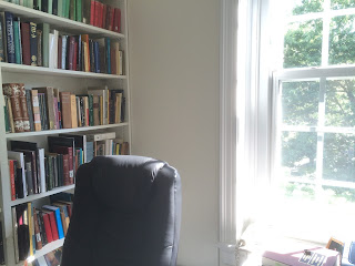
This happens a lot in indoor photos, where there's a window in the background (like this quick shot of my office I just took). The bookshelves look nice, but large portions of the window are over-exposed and therefore white, even though when I look out the window I can see the details of the tree out there.
My office with an over-exposed window.
The problem then is how to capture the entire dynamic range of a scene when it exceeds the camera's dynamic range. One way to do this is to take advantage of the camera's ability to capture the full range with a change of settings, that is, in multiple images.

Exposure fusion

The basic idea then is to combine multiple images so that the resulting image has the best exposed parts from each. Fortunately the software is out there to do the combining (or "fusing") automatically, so all you need is a set of appropriate pictures. In this case "appropriate" means images that range from very bright—where the darkest parts of the image don't register as completely black and have some detail in them—all the way to very dark—where the lightest parts of the image don't register as completely white and have some detail in them. You'll want at least one photo in the middle too. For example, the photo of my office is pretty good on the too-bright side. There's not a lot of contrast in the black of my chair and the books, but I don't think they're registering completely black either. I can easily check that with the histogram function in my image-editing software (Graphic Converter) which provides a plot of how many pixels in the image are at what level of brightness. (Histograms are a pretty standard feature of most image editors, including Mac OS X's standard Preview.)
Histogram of the over-exposed office photo.

The horizontal axis represents brightness level and goes from black on the left to white on the right. As you can see, this image has no pixels in the darker region on the left, and a lot in the very brightest on the right, confirming my guess that this would be a good "too bright" image.

So outside we go to take some pictures. Here are a few tips on doing that well:
  1. Use a tripod. You want to minimize the difference between the views in each image, so the software can more successfully combine them. You could try standing really still, and you might get decent results that way, but a tripod will keep the camera steady for sure.
  2. Take at least three photos. In most cases three will be enough (and you can get back to work on the site!). Your camera's histogram can help determine whether the photos are going to work well for this.
  3. Use exposure time to vary the amount of light, instead of varying the aperture size, which can affect the depth of field and so make the photos less similar.
  4. Take photos at least 2 stops to either side of the camera's automatic settings. This will be enough for most scenes, but you may find (as we will below) that scenes a larger range of brightness may need a bigger exposure range on the camera. (Here's where the histogram can show whether the photos have a wide enough range.) Many more expensive cameras as well as some cheaper ones can take a series of photos with the desired change in exposure automatically via their "exposure bracketing" function. Turn this on and when you press the button the camera will take one photo at the its automatic setting, one a fixed number of stops darker than that, and finally a third that same number of stops brighter. If you set the bracketing to go 2 stops in each direction, you'll get the desired range of 4. (The following photos were taken with a cheap Canon camera, which doesn't do exposure bracketing out of the box, but can with the free "Canon hack development kit" (CHDK) which adds scripting and a whole bunch of functionality to Canons.)
  5. If you're using an automatic process on the camera, set a short timer (2 seconds is a common one), so that any residual motion from your pushing the button will have stopped. Alternatively, f you have a remote control, use that instead.

An Example

My backyard provided the scene for this test case. It has an unusually wide dynamic range with a white garage in full sun and some heavily shaded grass.

Getting the images

Here are the three photos I started with, along with their histograms. They have a range of 4 stops:
Three photos with a range of 4 stops.
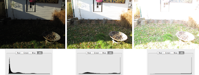
The camera's default (exposure time of 1/200s) is in the middle, and has some good detail in the shadows, but the sunlit part of the wall is completely washed out. You can see that in the histogram too: the darkest parts are close to black (on the left of the histogram), but a decent fraction of the brightest portions are at the maximum value. The darker image on the left has removed almost all the maxed out bright parts, and the darkest parts are still not at 0. The brighter image at right has a larger portion of the brighter sections at the max. Given that the darker image still hasn't removed the completely washed out portions, this turns out to be a scene that needs more than a 2-stop range. Fortunately I had the camera programmed to take a series of photos over an 8-stop range, so I had the other images already. Here's the new set, using 3 stops to either side of the default:
Three photos with a range of 6 stops.

You can see the the darkest image now has no pixels anywhere near the maximum brightness (and still very few at the maximum darkness). The bright image of course has even more washed-out areas, but it also has a lot more detail in the darkest parts too.

Fusing the images

Now that I have the images, they need to be combined. There are some commercial and free software applications out there that can do this for you. I use a free one, Hugin. (I've written about using Hugin before.) Hugin is designed to be a panorama maker, but making those requires a number of steps, including ones that do what we want here. While you can actually load up your photos into Hugin and use its graphical interface to do this (here's a tutorial), I'm going to break out the command line and directly access the underlying software goodness.

There are two applications to use from the command line. The first aligns the images and the second does the exposure fusion. Since I used a tripod, that first app really shouldn't have much to do, but I want to make sure that there are no problems with alignment, so I'm going to run it anyway. The app is rather straightforwardly called align_image_stack, and I use it with the -a option that tells it to align the images and save them to a series of similarly named tiff files. Once that's done, I use enfuse to do the fusing. Normally both processes take only a few minutes on my aging laptop. (As usual both applications can accept other parameters that modify how they work; I'm just keeping it simple here. RTFM for those details: enfuse and align_image_stack.) The exact commands (on my Mac) are (and ignore the leading numbers):

1> cd <directory of image files>

2> /Applications/Hugin/Hugin.app/Contents/MacOS/align_image_stack -a <newFileName>  <list of existing image files>

3> /Applications/Hugin/Hugin.app/Contents/MacOS/enfuse  -o <final filename> <list of files from previous step>

4> rm <intermediate files>

Here's what each command does:
  1. Change the working directory to the one that holds the images I want to fuse. Normally I keep each set of images in its own folder. That's not strictly necessary, but it makes some things easier and it's certainly more organized.
  2. Run align_image_stack on the images I want to work with. Since I'm in a directory without a lot of other stuff, I can often use a wildcard here: align_image_stack -a newFileName image*.tif. The newFileName is what the output files will be called. align_image_stack will automatically give them an extension of "tif", so you don't need to include one, and it will also suffix a number to this name, yielding, for example, "newFileName_0000.tf" as the first file. This process runs fairly quickly since the images were really already aligned, thanks to the tripod. When it's done, you'll see the new files in the directory.
  3. Run enfuse on the intermediate files. Again wildcards come in handy, so I typically give the intermediate files from step 2 a name different from the originals, like "aligned_image".
  4. Finally delete the intermediate aligned files from step 2.
This is pretty boring stuff, so I've created an AppleScript droplet that does it all for me. It's on GitHub.

The Result

Here's what the final image looks like (I turned the output tif into a jpeg to keep the download size reasonable):
Final enfused image (as a jpeg)


And here's the histogram for that:
Histogram of final output image

The histogram shows that both brightness extremes have been eliminated in the final image, and in the image itself both the bright sections (like the garage wall) and the dark ones (the shadows on the left) show a lot of detail. It's still possible to see where the shadow fell, but its intensity has been severely reduced.

Isn't this just "HDR"?

You'd think that, strictly speaking, high-dynamic-range images (HDR) would be images that have a greater than usual dynamic range, just like HDR monitors can produce a greater dynamic range than "normal" monitors. That might mean an image with more than the typical 10 stops your camera can capture. HDR can mean that, but what's usually meant is the result of taking such an image (often generated using techniques similar to exposure fusing) and manipulating it so that it can be viewed in a non-HDR medium (like a piece of photographic paper or your normal computer screen). This process is called tone mapping, and involves, as the Wikipedia page on HDR says, "reduc[ing] the dynamic range, or contrast ratio, of an entire image while retaining localized contrast." Depending on the algorithms used, this process can create vivid alterations in color and saturation, and give the image an artificial look. Such extreme applications are fairly popular these days, and probably what most people think of when you say "HDR".

But exposure fusion doesn't involve the creation of an HDR image with the subsequent tone-mapping, so it avoids the sometimes interesting effects you can find in some HDR photos. In fact the original paper on exposure fusion was called "Exposure Fusion: A Simple and Practical Alternative to High Dynamic Range Photography" [@Mertens2009]. That said, it is possible to use tone-mapping techniques that create images that look very similar to ones obtained from exposure fusion. The popular HDR mode on the iPhone seems to do this. (I haven't found a definitive statement on exactly what the iPhone does, but it's certainly taking multiple photos and combining them.) Here's a site comparing the two techniques. When you look at the histogram for our final image above, you can see that this is really a low-dynamic-range process.

Conclusion

So there you go. Next time you've got a scene with a very high dynamic range (which usually means some shadow on a sunny day) that you can't fix by other means, break out the tripod and your camera's bracketing mode and do some exposure fusion.

There's also a lot of information out there about this and other post-processing techniques (like HDR) that can improve your photos. You'll find that similar fusion techniques can be used for combining series of images with other variants, like creating large depths of field.

03 October 2015

A Practical application of markdown & pandoc

As I recounted in another post to this blog, I started using the text-only markdown format for my writing a few months ago. In part I did this to avoid future problems with file formats, and in part to be able to have one central file that I could convert to various formats as needed, ideally by using pandoc.
Most people probably will understand the problem with obsolete file formats. I’ve got some not so old WordPerfect files on my computer right now, for example (and you can find a bunch of them on my employer’s servers as well), but no WordPerfect app (or “program” as we used to call it). I can still read the ones I’ve tried to open, but I need to be a bit clever about it and I doubt many of my colleagues would succeed on their own. I also had a heck of a time converting my 1998 dissertation to a newer version of Word, losing a little formatting along the way.
But the major impetus for the effort in recent months has been the second goal of having one master file in markdown (mentioned very briefly in that other post). In particular I was thinking about streamlining the workflow for updating my CV, which I do as often as every few months. I keep a version of the CV on line as a web page, and another version in PDF for me to share more formally and for the curious to download from the web page. I wasn’t too thrilled with how the html printed, so I didn’t spend much time cleaning it up for that purpose and instead generated the PDF from an OpenDoc file which is easy to format (and which I edit with LibreOffice, BTW). My workflow then was something like:
  1. Edit the html with BBEdit.
  2. Edit the odt file with exactly the same content changes.
  3. Print the odt file to PDF.
  4. Post the html on line.
  5. Post the PDF on line.
  6. Archive the successive .odt and PDF versions by saving the new files with an appropriate name (I stuck the date in it).
In short, not a super long workflow, but still plenty of opportunity for those two versions to go out of sync (which they did). More annoyingly though, it was just too many steps.
When I learned about pandoc, I figured this was going to do it for me. Instead of worrying about odt and html, I’d just have one markdown file and spin that off into html and a PDF, avoiding odt altogether. That turned out to be harder than I’d expected, mainly because I knew virtually nothing about the tool pandoc uses to generate PDF, TeX/laTeX, and the default format didn’t look much like what I was used to generating. (My current default document format is based on the ideas in Matthew Butterick’s Practical Typography, which I highly recommend.) I also had the problem that the html wasn’t really printable in the format I was using: the links were underlined so visitors would know where to click, and it contained some info at the bottom including links that led to my department’s website and a few other places, all of which did not need to be included in the PDF.
At the heart of the problem is that markdown is a nice little tool, but it isn’t designed for formatting the text. That’s a pretty standard text-markup thing: put the document’s logical structure in it, but do the formatting elsewhere. Content not layout. So while you can say “this bit of text is a heading”, you can’t say what a heading should look like from within markdown. For that you need to use whatever formatting system your destination file requires (css for html, stylesheets for odt, and so on) and that’s where my ignorance of latex came into play. After a little bit of trying to get up to speed on laTeX, I decided to drop the idea of going directly to PDF and continue as I had been: print a file to PDF after it had been generated by pandoc. This was still an improvement over what I had been doing…as long as I could get the format right so I could use the html file for printing.
I put the project aside for a bit, but when I had to update the CV a few weeks ago, a few things occurred to me. First, I wasn’t using css to full advantage. I’d forgotten that it allows you to change styles depending on how the page is viewed. For example, the css can indicate one font for a big computer monitor and another for a smart phone. So I used that feature (specifically @media print coupled with the css pseudo-class last-of-type) to make that pesky final material disappear upon printing. I also made the links look like the rest of the text when printed. The other thing I realized was that my two-column format could easily be handled with standard html tables which I had abandoned years ago in an earlier version of the document and was now fudging in the markdown by using standard html…ugly. The last thing to do was use another css pseudo-class (first-of-type) to get my leading table to format differently from the other tables throughout the document. Here's what that last looks like. The contact details at the start are one table (the first in the document) and the educational institutions with dates are a second:

The last table is similar and disappears upon printing:
Where am I now with that workflow? Here’s the new one:
  1. Edit the markdown.
  2. Convert the markdown to html
  3. Print the html file to PDF.
  4. Post the html on line.
  5. Post the PDF on line.
  6. Archive the markdown and html on Github.
Strictly speaking the PDF in step 3 is only for me now, since viewers of the web page version could just print it themselves and get the right formatting. Nevertheless I post the PDF for downloading to make it easy. (Now that I think of it, I should probably keep track of downloads to see if that’s worthwhile.) Step 6 was my solution to all the archiving work I was doing. It still requires some action on my part, but with the OS X Github Desktop app it’s much easier and quicker than the old method. In fact although overall the number of steps is still the same, they entail a lot less work. Importantly the repeated and error-prone editing step is gone.

Lessons learned?

  • Pandoc is a great tool, but getting it to generate (nearly) identical-looking documents in different formats can be fairly hard. To be fair, it’s not really for that anyway.
  • If you don’t want to settle for default styles, you’re going to have to do a little work in your output format to get your document to look like you want. You may also have to compromise to get it to work in markdown.
  • It’s not always easy to step back and look at a problem with fresh eyes. I was so intent on rendering the original html in markdown that I didn’t realize that an easy(-ish) css solution was staring me in the face in the form of new html. Setting the project down for a while helped.
A final note: I continue to work (slowly) on my laTex knowledge, and have now got a generic document style going that looks fairly similar to my odt and html.
PS I don’t know why I’m capitalizing PDF, but not the other extensions.

19 August 2015

Archiving BMCR

Just a few days after my last post on archiving to fight link rot, Ryan Baumann (@ryanfb) wrote up his impressive efforts to make sure that all the links in the recently announced AWOL Index were archived. Since I was thinking about this sort of thing for the open-access Bryn Mawr Classical Review for which I'm on the editorial board, I figured I'd just use his scripts to make sure all the BMCR reviews were on the Internet Archive. (Thanks, Ryan!)

Getting all the URLs was fairly simple, though there was a little bit of brute-force work involved for the earlier years, before BMCR settled on a standard URL format. Actually there are still a few PDFs from scans of the old print versions which I completely missed on the first pass, but once I found out they were out there, it was easy enough to go get them. (I was looking for "html" as a way of pulling all the reviews, so the ".pdf" files got skipped.)

In the end less than 10% of the 10,000+ reviews weren't already on the Archive, but are now, assuming I got them all up there. Let me know if you find one I missed.

I'm still looking at WebCite too.

14 August 2015

Fight link rot!

Argh, it just happened to me again. I clicked on a link on a webpage only to find that the page on the other end of the link was gone. 404. A victim of link rot.

This kind of thing is more than a hassle. It's a threat to the way we work as scholars, where citing one's sources and evidence is at the heart of what we do. Ideally links would never go away, but the reality is that they do. How often? A study cited in a 2013 NYTimes article found that 49% of links in Supreme Court decisions were gone. The problem has gotten big enough that The New Yorker had a piece on it back in January.

What I wanted to do here is point out that there are ways for us scholars to fight link rot, mostly thanks to the good work of others (and isn't that the whole point of the Internet?). Back in that ideal world, publishers would take care that their links never died, even if they went out of business, but we users can help them out by making sure that their work gets archived when we use it. Instead of simply linking to a page, either link to an archived version of it or archive it when you cite it, so that others can go find it later.

I've used two archiving services, Archive.org and Webcite. Both services respect the policies of sites with regard to saving copies (i.e., via their robots.txt files), but Archive.org will actually keep checking policies, so it's possible that a page you archived will later disappear. That won't happen on WebCite. WebCite will also archive down a few links deep on the page you ask it to archive, while Archive.org just does that one page.

WebCite is certainly more targeted to the scholarly community, and their links are designed to be used in place of the originals in your work. But both of them are way better than nothing, and you'll find lots of sites using them. For convenience there are bookmarklets for each that you can put in your browser bar for quick archiving (WebCite, Archive.org).

So next time you cite a page, make sure you archive it. Maybe even use WebCite links in your stuff (like I did in this post on the non-Wikipedia links).

(FYI, another service is provided by Perma.cc, which is designed for the law, covered in this NPR story.)

Added 18 August 2015: Tom Elliott (@paregorios) notes this article on using WebCite in the field of public health (which I link to via its DOI).

20 July 2015

Frequent Latin Vocabulary - sharing the data(base)

When I first started teaching after grad school, I did a lot of elementary-Latin instruction. I felt well prepared for this because I did my graduate work at the University of Michigan, where the Classical Studies Department has a decades-long tradition of paedagogical training. It includes people like Waldo "Wally" Sweet, Gerda Seligson, Glenn Knudsvig, and Deborah Ross. One consequence of this teaching and preparation was that I became very interested myself in Latin paedagogy and my first research output was in this direction.

In particular I started looking at the Latin vocabulary that students were learning and how that related to the vocabulary that they were reading in the texts they encountered in intermediate and upper-level classes. As I investigated this, I learned that there had been a lot of work on exactly this area not only among people studying second-language acquisition, but also in Classics circles back in the 1930s, 40s and 50s. One of the more interesting people in this area was not someone that many classicists will not know, Paul B. Diederich. Diederich had quite an interesting career, working even at that early date in what is now the trendiest of educational concerns, assessment, mainly in writing and language instruction, and eventually making his way to the Educational Testing service, ETS, which gave us the SAT.

Diederich's University of Chicago thesis was entitled "The frequency of Latin words and their endings." As the title suggests it involves determining the frequency of both particular Latin words and endings for both nouns/adjectives/pronouns and verbs. In other words, a bit of what would now qualify as Digital Humanities, Diederich of course lacked a corpus of computerized texts and he had to do this counting by hand. So he made copies of the pages of major collections of Latin works, using different colors for different genres (big genres, like poetry and prose), and then cut these sheets of paper up so that each piece contained one word. Then he counted up the words (over 200,000!) and calculated the frequencies. This biggest challenge he faced was the way his method completely destroyed the context of the individual words; once the individual words were isolated, it was impossible to know where they came from. One result of this was acknowledged by Diederich in the thesis: not all Latin words are unique. For example the word cum is both a preposition meaning "with" and a subordinating conjunction "when/after/because." This meant that Diederich needed either to combine counts for these words (which he did for cum), or label such ambiguities before cutting up the paper. As he himself admits, he did a fairly good job of the latter, but didn't quite get them all. Another decision that had to be made was what to do with periphrases, that is, constructions that consist of more than one word. Think of the many English verb forms that fall into this category: did go, will go, have gone, had gone, am going, etc. Do you want to count "did go" as one word or two?

Interesting to me was that Diederich was careful to separate words that the Romans normally wrote together. These usually short words, called enclitics, were appended in Latin to the preceding words, a bit like the "not" in "cannot" (which I realize not everyone writes as one word these days). This was a good choice on Diederich's part, as one of these words, -que meaning "and," was the most frequent word in his sample. (As a side note, some modern word-counting tools, like the very handy vocab tool in Perseus, do not do count enclitics at all. Such modern tools also can't disambiguate like Diederich could, so you'll see high counts for words like edo, meaning "eat," since it shares forms with the very common word esse, "to be." Basically we're trading off automation, and its incredible speed increases, for lack of ambiguity.)

The article I eventually published (“Frequent Vocabulary in Latin Instruction,” The Classical World 97, no. 4 (2004): 409-433) involved me using the computer to create a database of Latin vocabulary and then counting frequencies for a number of textbooks, comparing them to another set of frequent-vocabulary lists. I put some of the results of this work up on the internet (here, for example), but didn't do a lot of sharing of the database itself. This wasn't so easy way back in the early 'aughts, but it is now. Hence this post (which is a great example of burying the lede, I suppose).

I created the database in FileMake Pro version 3. Then migrated to version 6, then 8, and now 12. (Haven't made the jump to 13 yet.) Doing this work in a tool like FMP has its pros and cons—and was the subject of some debate at our LAWDI meetings a few years ago. Big on the pro side is the ease of use of FMP and the overall power of the relational-database model. On the con side is the difficulty in getting the data back out so that it can be worked on with other tools that can't really do the relational thing. For me FMP also allowed the creation of some very nice handouts for my classes, and powerful searches once I got the data into it. In the end though, if I'm going to share some of this work, it should be in a more durable and easily usable form, and put someplace where people can easily get to it and I won't have to worry too much about it. I decided on a series of flat text files for the format, and GitHub for the location. I'm going to quote the README file from the repository for a little taste of what the conversion was like:

Getting the data out of FMP and into this flat format required a few steps. First was updating the files. I already had FMP3 versions along with the FMP6 versions that I had done most of the work in. (That's .fp3 and .fp5 for the file extensions.) Sadly FMP12, which is what I'm now using, doesn't directly read the .fp5 format at all, and FMP6 is a Classic app, which OS X 9 (Mavericks) can't run directly. So hereʻs what I did:
  • Create a virtual OS X 10.6 (Snow Leopard) box on my Mavericks system. Snow Leopard was the last OS X version to be able to run the Apple Classic emulator, Rosetta. That took a little doing, since I updated the various sytem pieces as needed. Not that this version of OS X can be super secure, but I just wanted it as close as possible.
  • Convert the old .fp5 files to .fp7 with FMP 8 (I keep a few versions of FMP around).
  • Archive the old .fp5 files as a zip file.
  • Switch back to Mavericks.
  • Archive the old .fp7 files. I realized that the conversion process forced me to rename the originals, and zipping left them there, so I could skip the step of restoring the old filenames.
  • Convert the .fp7 to .fmp12.
  • Export the FMP files as text. Iʻm using UTF-16 for this, because the database uses diarheses for long vowels (äëïöü). Since this is going from relational to flat files, I had to decide which data to include in the exports.
  • Convert the diarheses to macrons (āēīōū). I did this using BBEdit.
  • Import the new stems with macrons back into FMP. I did it this way because search and replace on BBEdit is faster than in FMP.
  • Put the text files [on Github].
FMP makes the export process very easy. The harder part was deciding which information to include in which export. An advantage of the relational database is that you can keep a minimal amount of information in each file and combine it via relations with the information in other files. In this case, for example, the lists of vocabulary didn't have to contain all the vocabulary items within their files, but simply a link to those items. For exports though you'd want those items to be there for each list. Otherwise you end up doing a lot of cross-referencing. It's this kind of extra work, which admittedly can be difficult, especially when you have a complicated database that you designed a while back, that makes some avoid FMP (and other relational databases) from the start.

In the end though, I think I was successful. I created three new text files, which reflect the three files of the relational database:
  1. Vocabulary is in vocab.tab. These are like dictionary entries.
  2. Stems, smaller portions of vocal items, are in stems.tab. The vocab items list applicable stems, an example of something that was handled relationally in the original.
  3. The various sources for the vocabulary items are in readings.tab. It lists, for example, Diederich's list of 300 high-frequency items.
I also included the unique IDs that each item had in each database, so it would be possible to put them back together again, if you wanted (though you could just ask me for the files too). See the README and the files themselves for more detail. I feel pretty good though about my decision to use FMP. It was—and is, even if I'm not teaching a lot of Latin these days—a great tool to do this project in, and getting the data back out was fairly straightforward. 

You can check out the entire set of files at my GitHub repository. And here's a little article by Diederich on his career. He was really an interesting guy, a classicist working on what became some very important things in American higher education.

07 July 2015

List of undergrad Classics programs - more pandoc & github

I've kept ("maintained" would be too strong a word) a list of undergraduate classics program for a while now. I first started it when I was the webmaster for the American Classical League back in grad school and early in my career, but then I just kept it around because it seemed like a shame not too.

The other day I got a now rare update from someone on the list, and I thought this would be a good time to change the way I handle the whole thing.

First I figured I'd switch over the basic form of this very simple page from html to the easier to manage markdown, and then change my workflow to use pandoc to generate the html from this markdown whenever necessary. This part was fairly simple, though there were a few complications. For example, pandoc doesn't like html name tags, so in order to keep a bunch of internal links I had, I needed to convert those anchors to spans with IDs that matched the names I was using. BBEdit and its nice search-and-replace functionality to the rescue. I then did some minimal tweaks to the new pandoc-generated markdown file, so that pandoc could now generate some decent html from it.

Step 2 was to put the new markdown and html up on GitHub, instead of in my institutional filespace. Not only does this give me some version control over the files, but I can let other people edit the markdown and send me pull requests, instead of emailing me updates that I then put into the file. I don't think I'll get a lot of these, but you never know.

So I can now (1) make changes to the markdown myself, or accept pull requests with them in it, (2) sync my local github repo with the on-line version, (3) run pandoc on my local copy, and (4) sync it back to GitHub where I release a new tagged version. I then link to the files directly via rawgit. (The tag in GitHub is needed to make rawgit grab the correct version instead of the one it caches.)

The relevant links are here:


Check out the list and let me know about any updates via a pull request!

10 June 2015

Self-publishing with pandoc, etc

Depending on your thinking, I'm either just done with or approaching the end of a sabbatical. ("Just done with" if you think that once commencement occurs, it's just a regular summer.) Among the things I produced in the past few months is a very short "note" on a topic that doesn't fall within my usual area of research. I sent it to a couple of OA journals, but neither wanted to publish it as is. I'm not interested in doing more with it at this time, but it seems silly to have it just sit on my hard drive doing nothing. It's the kind of thing I'd do as a conference paper, if I went to a conference at which I think it'd be welcome. But since I don't go to such conferences, I figure I'll just put it out there for people to check out anyway. (The advantages of tenure and the internet!)

I could do it as a blog post, though it's already written in a more "academic" style than I write this blog in. Instead I'm going to post it as html on github and as a pdf on my account at figshare, where it's easily accessible, archived, and even gets a DOI. I'll also link to it from my academia.edu page (as well as here, obviously).

The Workflow

I've started using markdown with pandoc to generate documents. I was inspired by Dennis Tenen and Grant Wythoff's post last year, "Sustainable Authorship in Plain Text using Pandoc and Markdown," but I've long been a fan of avoiding proprietary formats that are likely to become obsolete (no doubt in part because I work with very old texts and materials professionally). It's easy enough to do simple stuff this way, but getting to more complex documents requires some work. Here's a list of stuff I do/use:

  • For editing my markdown documents, I use the free MacDown, which gives a nice split screen, showing the raw markdown on the left and the interpreted version on the right. There are a number of pandoc "enhancements" to markdown that MacDown can't handle, but it gets the vast majority of the formatting right and it prevents me from making stupid mistakes in that majority.
  • I keep all my bibliography in Zotero. I export it all as a a bibtex file using Better BibTeX, which provides some nice customization of the export entries. Once this bibtex file is created, I can easily cite the works in it within markdown and then let pandoc-citeproc expand them as appropriate.
  • I've given up on using pandoc to produce final versions of the same file in different formats. I'm mostly interested in html, OpenDoc, pdf and—sadly—Word. There are just too many complications in academic documents (footnotes, etc) and my skills and time are limited. LateX PDFs have a certain look to them, but anything I can print, OS X can turn into a PDF, so that's not a big deal for me. In most other cases, I don't need both html and odt/docx versions, so I can skip it there too. (I was really hoping that I could generate my CV in html and PDF directly, since I've been maintaining html and odt versions, the latter of which I turned into PDF via OS X, but I've yet to get enough into LateX to be able to reproduce my mildly complicated CV format.)
  • For html, I use a few different versions of my standard css file. It's all up on github, so you can see what I've done. I just discovered rawgit.com, so now I'm converting my html files to refer to the css files there, instead of on the institutional server that I've been using (and which has recently become a bit more difficult to keep updated from home). FYI, I usually edit css field manually with BBEdit, but I'm trying out CSSEdit, which seems to have been EOL'ed.
  • On the pandoc side, I've tweaked the default templates for html, odt and docx, so that they can handle multiple authors, as well as a license field in the header. Again, all on github.
  • To tie it together a bit, I wrote an applescript that takes the frontmost document in MacDown and runs it through pandoc, outputting whatever type of file you want (based on extension) and also allowing user-inputted pandoc switches.
The overall process then runs like this: write in MacDown, incorporating the citation keys from Zotero; process that with pandoc to generate the desired final file type; publish/share/whatever.

It's seems easy when I write it like that.

Numbering for citation

My one concern with html output of the note that I just wrote was that html has no default pagination, and pages are usually the way one cites an article. So instead of numbered pages, I decided to go with numbered paragraphs. (Read about Sebastian Heath's approach to articles he's editing for ISAW.) But how to number them, so that the numbers were visible (for easy citation) and so that I didn't have to manually put them in? With a little help from the pandoc Google group, I combined some features of pandoc with css. Since pandoc automatically gives IDs to headers and css allows for formatting those headers and even for auto-numbering them, I put a nearly empty level-6 header at the start of each paragraph in my markdown document and I used css to number them and put that number off in the margin. (They're nearly empty because markdown won't create empty headers.) Although the numbers are visible to a human reader, the IDs aren't ideal: section, section-1, section-2, and so on, but they are sequential and linkable. The headers are also a bit ugly in markdown, but they work and they also make it possible for me to indicate logical paragraphs instead of the actual ones. This is useful, for example, when there's a block quote, which technically creates a new paragraph, right in the middle of a logical paragraph.

One more thing, since I'm using css to number the paragraphs in the html version, those numbers are technically part of the display of the article, not part of its content. So you can see them, but you can't find them if you search in your browser. That's not the case in the PDF; there the numbers are "real" and you can find them in a search.

The Article

So about the article itself...it has to do with the original nature of the Golden Calf in Exodus 32. I speculate that it was in origin a "corn calf," to be associated with a lost harvest ritual. Go have a read:

15 January 2015

The Humanities Open Book Program (@NEH_ODH)

The NEH and Mellon Foundation just announced a new project today, under the broader auspices of the NEH's The Common Good: The Humanities in the Public Square project. It's called the Humanities Open Book Program and will provide funds so that organizations can "digitize [out-of-print scholarly] books and make them available as Creative Commons-licensed 'ebooks' that can be read by the public at no charge on computers, mobile devices, and ebook readers."

This is great. There are lots of books that fall into this category and would see a lot more use if there were available digitally. I'd love them for myself, but I can also imagine assigning them (or parts of them) more frequently to my students. Also great is that the program insists that the books be released in the EPUB format, which is open, looks good on lots of readers, and makes it fairly easy to get the text out.

Regarding that last, a potential limitations that I hope we don't actually see too much of results from the program's lack of a specific requirement that the work be re-usable. Instead what's required is a CC license. Any CC license. That means that in reality there's no guarantee that it will be possible to reuse the work (apart from the usual fair-use ways). I tweeted this question and @NEH_ODH replied quickly (love those guys):
So let's hope that lots of publishers do make the choice to allow such re-use. I'm worried about it in part because we know what publishers can be like. On the other hand, the program explicitly solicits applications from more than just presses: "scholarly societies, museums, and other institutions that publish books in the humanities," and these groups might be a little more inclined to use a more permissive license. A little outside pressure might not hurt either.

(If @NEH_ODH would like to comment, I'd be curious to know why they didn't impose a more open licensing requirement. Worried that publishers might not respond so openly?)

07 December 2014

Police-related Killings

Like a lot of people, I've been viewing all the recent (and not so recent) news about police-related killings with a mix of sadness and outrage. I was really surprised to find out that the government doesn't collect good data on this and that the number that's often tossed about is just plain wrong.

In the 538 article I just linked to, a few crowd-sourced projects are mentioned:

Then there are some Wikipedia pages on the same topic, with killings listed by month. (Here's November, which is fairly complete.) I've been contributing to the Wikipedia pages and also the Facebook page.

Finally there's the Gun Violence Archive, which is a broader project aimed at providing "accurate information about gun-related violence in the United States."

As I'm watching a lot of communication and cooperation around data projects in my academic life, I'm wondering why these projects can't do the same thing. With at least four separate crowd-sourced projects tracking essentially the same data—though the Facebook page and Wikipedia pages don't include as much detail as the others—that's a lot of duplication of work happening. It would be easy enough to generate most of the entries in the Wikipedia tables from the data in one of the other two projects in the list above, so some of it could be reduced, but there would still be a lot left in those two projects. In addition they've got their data in Google docs, which are handy, but mean a lot of anonymous editing and a reliance on Google to keep the service around (which I realize is more of a long-term worry). FatalEncounters has already had a problem with vandalism and has moved to a much more labor-intensive method for updates.

So I've emailed the responsible parties there and am hoping there can be some deeper cooperation and maybe some better current and long-term access to the data arranged (GitHub?).

I'll keep you posted.

PS In addition to 538, there's also this effort to work with the Facebook data, which also provides a link to those data, which are hard to get from Facebook directly.

04 October 2014

Pole Aerial Photography on an archaeological dig

A recent post by Chiz Howard over at the Urban Archaeology blog covers his efforts to make a pole-mounted camera. I figured I'd share my own experience doing something similar on our site in Italy.

I was mainly interested in getting better quality overhead shots for archival purposes, so what I wanted was a camera view of as close to perpendicular to the ground as I could get, and, ideally, from a fairly high vantage point to include as much ground as possible. It turns out—not surprisingly, in retrospect—that there's a whole community of people out there on the internet who do this sort of thing (PAP, for "pole aerial photography, not to be confused with KAP for "kite"), so I didn't need to re-invent the wheel on this.
PAP in action
PAP in action, with our former apparatus in Paolo's hand in foreground.

My choices were also partly informed by a very practical reality: I had to get this stuff to Italy from the US, since I wanted to test it before going, and I wasn't sure I could get everything once in Italy and I certainly didn't want to have to pay for extra shipping. (Honestly, I hadn't tested far enough in advance to trust the Italian mail to get it to me either.) There is a big Home Depot-type place (Leroy Martin) about 45 minutes away, but I wasn't going to take a chance on them having what I needed.

The Rig

The Camera

Camera equipment
For my camera, I went with a light-weight, inexpensive, but fairly good quality digital camera, the A4000 from Canon (in electric blue), which I picked up for about $100. Canons have the added advantage of being programmable (really "hackable," which is loads of fun in its own right), and of course there's an on-line community for that too. This meant that I could use an existing program (an intervalometer) to have the camera take photos at predetermined intervals all on its own for the whole time it was on the pole. The A4000 is also nice and small, so it's a good camera to travel with. I also picked up a few extra batteries and a charger that shipped with a 12-V car-plug adapter (which I ended up not using). For memory I used 16GB SD cards, which effectively means I never had to worry about running out of storage space. (For the extra-cautious, I find SD cards are also a great way to back up your season files, photos and all, before traveling home.)

Since most pictures were taken in full daylight during the Italian summer, the auto setting on the camera resulted in a low ISO, small f-stop and fairly short shutter speed. For example, in the shot below (as you can see from the embedded EXIF), the ISO was 100, shutter speed 1/1000, and f-stop 3. All of which means I didn't have to worry about the photos being out of focus because of any slight movement in the pole, though the picavet works to dampen those anyway. Just to be sure though, I forced the camera to use ISO 100. The intervalometer program I linked to above also allows you to set a minimum shutter speed and aperture, so you can make sure to get good photos in more marginal lighting conditions. Yet another advantage of the A4000 is a large depth of field, another thing that works to mitigate focus problems.

The Pole

Me setting up with partially collapsed pole
The travel and shipping considerations meant that a lot of the options for poles were out of consideration, unless I wanted to pay for extra shipping or baggage. In the end I went with a 6m (20') collapsible flagpole. Since the camera only weights about 150g (6 ½ oz), I figured that was a lot less than any flag in the wind. It came in a box that was under the "big" baggage limits for the airlines, so I could take it with me without a problem.

The Mount

For attaching the camera to the pole, I decided to go with a picavet, an apparatus that would keep the camera perpendicular to the ground. This requires two attachment points to the pole, and conveniently enough the flagpole shipped with several adjustable mounts. Out of concern for weight I decided to use a cloth picavet.

Conclusion

I ended up being very happy with the results. Not only did we get better overheads than in previous years, from a greater distance and better quality, but they were easier to get, meaning that we took a lot more of them. I was also able to do some photomosaicking with the photos, as I wrote in my last post, which was very nice. (In fact I'm working on a larger-scale one now; food for a future post.) For the future, I'm going to try to make a rigid picavet from plywood or aluminum. The cloth is handy and works, but it gets a bit messy with all the string around. I'd also like to use WIFI SD cards, as I wrote above, so I don't have to keep taking the card in and out.

Overhead of the crew at work. 5m or so wide.
